Color is not merely a visual element; it is a fundamental tool that influences user emotions, behavior, and engagement with digital products.
From calming blues in meditation apps to the urgency of red in promotional banners, colors are deliberately chosen to shape user perception. Well-established brands utilize color to evoke specific emotions, strengthen brand recognition, and enhance readability and accessibility. Understanding these principles allows designers to create digital experiences that are both aesthetically pleasing and functionally effective.
The Foundations of Color Theory
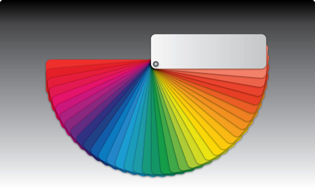
Effective color selection is rooted in a strong understanding of color theory, which includes hue, saturation, and brightness. These attributes shape the way colors interact and influence the overall aesthetics of a design.
- Hue: The pure spectrum color, defining its position on the color wheel. Selecting hues with complementary or analogous relationships enhances color harmony.
- Saturation: The intensity of a color, where high saturation creates vibrancy and low saturation results in a muted appearance. Designers use saturation to emphasize key elements, such as call-to-action buttons.
- Brightness: The lightness or darkness of a color. Ensuring sufficient contrast between text and background colors improves readability and accessibility, particularly for users with visual impairments.
Mastering these principles enables designers to create visually balanced and engaging digital interfaces.

Understanding the Psychology of Color
Color psychology plays a critical role in digital design, influencing how users interact with a product and how they feel while using it. Certain colors evoke specific emotions and drive user decisions, making them a strategic component in design.
For example:
- Trust and security: Blue, commonly associated with stability and professionalism, is frequently used by financial institutions and tech companies.
- Excitement and urgency: Red, known for stimulating energy and action, is often employed for limited-time offers and sales promotions.
- Creativity and enthusiasm: Orange exudes warmth and playfulness, making it ideal for entertainment and lifestyle brands.
- Luxury and sophistication: Purple conveys a sense of elegance and exclusivity, often used by high-end brands.
- Cleanliness and simplicity: White promotes clarity and minimalism, commonly seen in modern and tech-focused designs.
By strategically implementing these colors, designers can evoke desired responses and guide user interactions more effectively.
Subscribe our Youtube channel @wiladio for more interesting video about Design, Science, Tech, and Game
Psychology of Color & When to Use Them
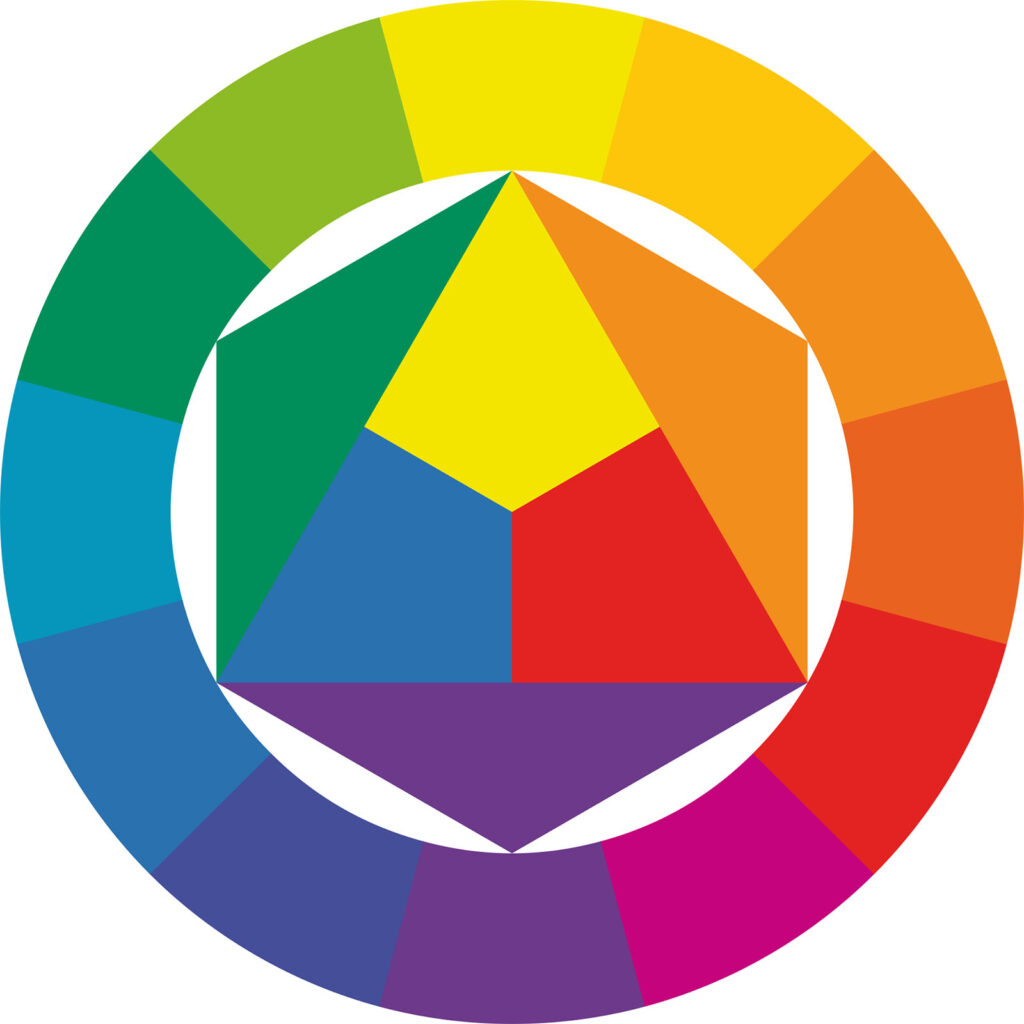
Primary Colors (Red, Blue, Yellow)
These colors cannot be created by mixing other colors and are the foundation for all other colors.
Red (Hex code #FF0000) – Passion, energy, urgency, excitement, danger, love
When to use: Fast-food logos (McDonald’s, KFC) to stimulate appetite, sale signs to create urgency, romantic themes.
Blue (Hex code #0000FF) – Trust, stability, calmness, professionalism
When to use: Corporate branding (IBM, Facebook) for reliability, healthcare to evoke trust, financial institutions.
Yellow (Hex code #FFFF00) – Optimism, warmth, attention, happiness
When to use: Warning signs for visibility, children’s brands for playfulness, marketing to grab attention (McDonald’s, IKEA).
Secondary Colors (Orange, Green, Purple)
Created by mixing two primary colors.
Orange (Hex code #FFA500 Red + Yellow ) – Creativity, enthusiasm, friendliness
When to use: Call-to-action buttons, sports branding, energetic advertising (Fanta, Nickelodeon).
Green (Hex code #00FF00 Blue + Yellow) – Growth, health, nature, wealth
When to use: Environmental branding (Animal Planet, Whole Foods), financial businesses, health products.
Purple (Hex code #800080 Blue + Red) – Luxury, spirituality, wisdom, mystery
When to use: Beauty products, high-end brands (Cadbury, Hallmark), meditation or mystical content.
Tertiary Colors
These are created by mixing a primary color with a neighboring secondary color.
- Red-Orange (Hex code #E34234 Vermilion) – Energy and warmth (Used in sports and adventure brands).
- Yellow-Orange (Hex code #FFBF00 Amber) – Confidence and cheerfulness (Used in fun, youthful designs).
- Yellow-Green (Hex code #DFFF00 Chartreuse) – Freshness and innovation (Used in tech and eco-friendly branding).
- Blue-Green (Hex code #008080 Teal) – Balance and sophistication (Used in healthcare, wellness brands).
- Blue-Purple (Hex code #4B0082 Indigo/Violet) – Mystery and creativity (Used in fantasy, artistic brands).
- Red-Purple (Hex code #FF00FF Magenta) – Passion and femininity (Used in fashion and cosmetics).
Applying Color Psychology in Design
A strategic approach to color selection involves understanding the brand, audience, and cultural context. Designers must carefully consider how their choices impact user perception and usability.
A practical framework for incorporating color psychology includes:
- Defining brand identity: Establishing the emotions and messages that align with the brand’s personality.
- Selecting a primary color: Choosing a dominant color that represents the core identity.
- Incorporating secondary and accent colors: Enhancing contrast and creating a visually dynamic interface.
- Considering cultural differences: Researching how color meanings vary across regions to ensure global relevance.
- Testing and iterating: Gathering user feedback and refining color choices based on user experience.
This methodical approach ensures that color decisions enhance usability and align with business goals.
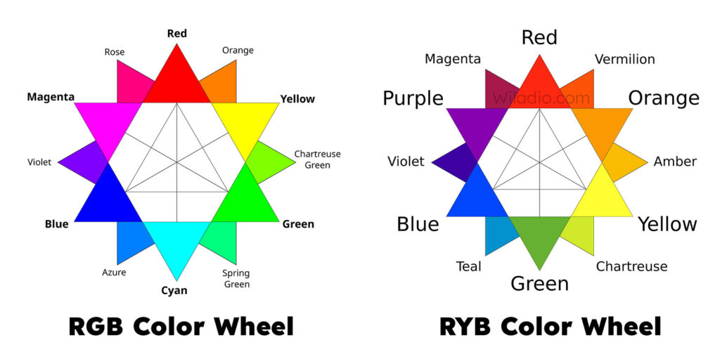
RGB vs. RYB Color Wheels
The RGB color model (Red, Green, Blue) is an additive color model used primarily for digital displays, such as TVs, computer monitors, smartphones, websites, and projectors. It works by combining different intensities of light to create colors, with full intensity of all three resulting in white. This model is best suited for digital design, including UI/UX design, video editing, motion graphics, and digital photography, where colors are displayed through emitted light rather than physical pigments.
On the other hand, the RYB color model (Red, Yellow, Blue) is a subtractive color model traditionally used in painting, fine arts, and physical media like pigments, paints, and dyes. Instead of adding light, colors are created by mixing pigments, and combining all three primary colors results in a dark brown or black. RYB is ideal for traditional art forms, craft design, textile design, and art education, where physical color blending is essential.
The key distinction between these models lies in their application: RGB is used for digital and screen-based work, while RYB is used for traditional and artistic mediums involving pigments. However, for print design, CMYK (Cyan, Magenta, Yellow, Black) is typically preferred over RYB, as it is optimized for ink-based printing processes.
Creating Balance with the 60-30-10 Rule
Design consistency is essential for a visually harmonious and user-friendly experience. The 60-30-10 rule is a widely used guideline for maintaining balance in color palettes.
- 60% dominant color: Establishes the overall tone of the design, typically used in backgrounds or large elements.
- 30% secondary color: Provides contrast and is applied to key elements such as headers and buttons.
- 10% accent color: Highlights crucial details and draws attention to specific areas, like call-to-action elements.
This structured approach prevents color overload and ensures a cohesive aesthetic across digital products.
Conclusion
Color in graphic design is more than just decoration; it’s a powerful tool for communication, emotion, and engagement. By mastering color psychology, harmony, and application, designers can create visually compelling and effective designs that leave a lasting impact. Whether crafting a brand identity or designing a poster, thoughtful color choices enhance aesthetics and functionality, making design work truly stand out.
THE END
More Design articles: https://wiladio.com/category/design/