Recently, following its merger with Asiana Airlines, Korean Air has officially revamped its brand identity after more than four decades of establishment and development. The goal is to reposition the brand as an international airline rather than a national one, as it has been perceived thus far.
MEANING BEHIND THE NEW DESIGN
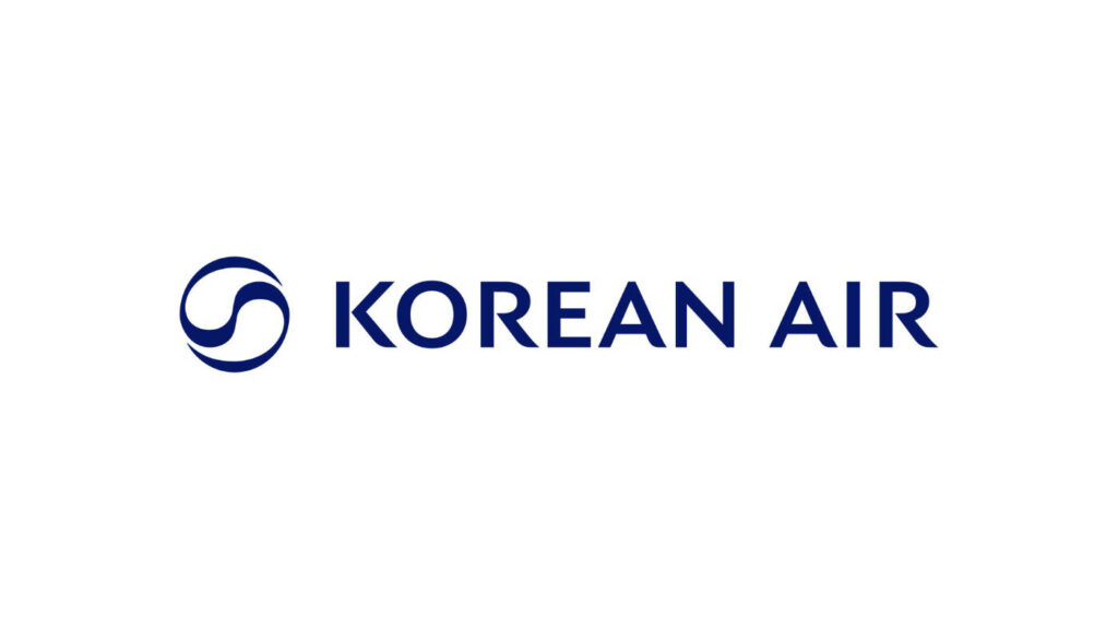
Korean Air’s new logo is a combination mark, featuring both a lettermark and a pictorial mark that complement each other to convey a cohesive meaning.
Designed by the global branding consultancy Lippincott, the Korean Air logo has been updated with a more modern typeface, while the icon retains inspiration from the Taeguk symbol found on the South Korean national flag.
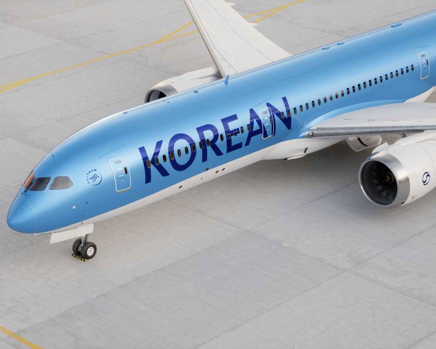
In terms of the lettermark, the new “KOREAN AIR” name is rendered in a geometric sans-serif font, with each character appearing neater and clearer, moving away from the thick, bold style of the old logo. This new typeface draws inspiration from East Asian calligraphy brushstrokes, featuring distinctive dot-like flourishes at the end of each character.

As for the pictorial mark, the Taeguk—a significant Taoist symbol consisting of two interlocking pieces representing the harmony of Yin and Yang—has been reimagined. To align with the vision of a global brand, the Taeguk symbol has been modernized: it retains the shape of the two blended elements but breaks free from its traditional circular frame. Additionally, the iconic red and blue colors typically associated with the Taeguk on the South Korean flag have been omitted. While the old logo unmistakably reflected Korean identity through its resemblance to the national flag, the new logo strikes a more neutral and contemporary tone.
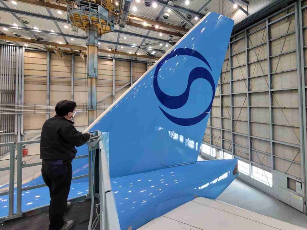
Discussing the challenge of redesigning the Taeguk symbol, Dan Vasconcelos, a partner at Lippincott, shared: “In Korea, the Taeguk symbol is everywhere, much like the Union Jack on the British flag or the stars and stripes on the American flag. Our challenge was to craft a Taeguk that feels unique to Korean Air while preserving its significance as a national symbol.”
With this in mind, Dan believes that using a ribbon-like form for the pictorial mark lends the new logo an elegant yet dynamic flair.
Subscribe our Youtube channel @wiladio for more interesting video about Design, Science, Tech, and Game
HOW THE NEW LOGO ENHANCES EXPERIENCES
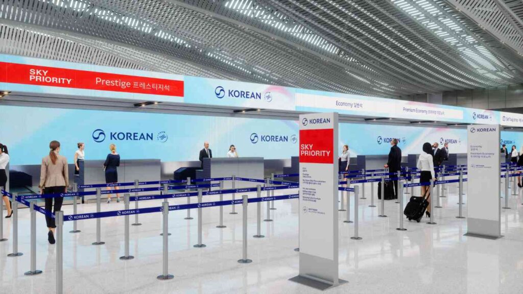
The new Korean Air logo has already been rolled out across all facets of the airline—from the livery painted on aircraft fuselages to imagery in airport lounges, as well as the brand identity across print materials and the airline’s website.
As South Korea’s largest airline, this rebranding is a pivotal move to align customer perceptions with the company’s new vision. Beyond aesthetics, Korean Air has a clear plan to enhance the customer experience in tandem with this change. The new logo serves as an “activation signal”—whenever customers see it, it triggers associations with fresh experiences. The memories of flying with the old Korean Air will gradually be replaced by the new experiences the airline aims to deliver.
FINAL THOUGHTS
The first flights of Korean Air in this new era officially took off in March 2025, marking the beginning of a fresh chapter for the airline and a bold step onto the international stage. With ambitions to modernize while retaining its unique identity, let’s continue to watch how Korean Air evolves in this exciting new phase!
THE END
More articles: https://wiladio.com